Folks, I am doing some work on the blog these days… or trying to. I am among other things trying to get updated to a newer version of WordPress. This will involve a theme change, perhaps, since my presently overly-hacked theme isn’t much liked by the newer version of WordPress. So, I am playing around a little while waiting for my expert help on the back end of the blog:
Here is a screen-shot of one possibility (which you can click for a larger version:
POSSIBILITY 1
I also finally found a rework of the present theme in a monochrome, skeltal form which given some effort could be modified to look like the present theme. However, I think I would like to do more with widgets etc. that newer themes permit.
Alas, I just can’t get anything going with a graphic artist/designer yet.

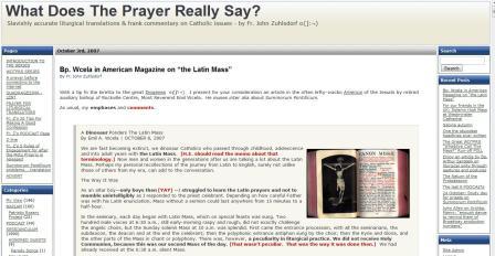
















Well, the picture of the possible new look isn’t too bad.
I think any change might be a bit awkward at first, but I think well get
used to it.
The content is what is important, and I hope you don’t change that at all.
Keep up the good work, and I hope the transition to a new format works easily.
Roman Sacristan: I am also rethinking the direction a little, but not in way that would affect content too much. I am trying to figure out how audio streaming and the PODCAzTs and maybe vloging might be integrated. But before that I would need some graphic design help, I think.
Peace be with you!
I like the proposed design via the screenshot. It seems to be tidy, user-friendly, and- most importantly- sensibly organized.
May God bless you!
Holy Mary protect you.
-Christopher
POSSIBILITY 2:
A few thoughts in reference to the one on the main page, which i like the best,
First, I am a little concerned that the font is not quite as easy to read as in the current version of wdtprs.
Also I think that the categories get a little jumbled together and its hard on my eyes to distinguish one from another –so you will likely get a lot of people on the main page, but some amount of frustration when they are looking to do anything else.
Also, it would not hurt to make the logo an image, with a more specific font that really reflected the mood of the page.
Lastly the color design is nice, but seems somewhat sterile–perhaps it would be neat to make the border of the posts in the appropriate color of the liturgical season…
Cheers
Alan: logo an image, with a more specific font that really reflected the mood of the page.
From your lips to God’s ear (and that of some graphic artist. I would very much like some sort of identifying logo for this project. However, I can’t find anyone reliable to work on it. Some people will say “Gee, I’ll help” and when I write to them, they vanish, as if into thin air. This is often the way of things, I’m afraid.
But your idea is spot on.
Here is yet another
POSSIBILITY 3
I like the second version better because the Recent Comments is nearer the top. I always look first to see if you yourself have added a new post, and then at the Recent Comments for those added since my last look.
Fr Z
The new look is fresh. I’d like to see you retain ” W D T P R S” in the title.
Thanks.
m
Enough of modernisation!
Keep the Usus Antiquor!
The third design option looks great (black & grey) but I’d replace the red star with your biretta sig. Also, some of that page nav should be moved to the right as there’s too many options in the header with that design.
Look forward to whatever you come up with. God bless you, Father, preserve you, and remain with you forever.
Christopher
Roman Sacristan:
Don’t take it personally, but the notion that “the content is what is important”, implying that the form doesn’t really matter, is completely wrong, and lies at the centre of the catastrophe that has befallen the sacred liturgy since the middle of the last century. But it is wrong generally. As humans, we are sensory beings, or, as St. Thomas puts it: “homo nominatur animal a natura sensibili”.
Out of designs 1-4, I like #1 the best, but I also like the colors used in #4. Generally, a somewhat offwhite (or even pastel colors like you have in your present comments section) background color is easier on the eyes than black text on a white background. I like the “Recent Comments” feature, but I don’t think it necessarily has to be near the top of the page.
I am in the midst of upgrading the version of WordPress on my hosting account. Prayers would be appreciated.
The third design looks great. Perhaps a poll could help you decide which to use.
And at last, there is a search feature!!!
it is the content of the blog that matters most…as long as we learn something each day and occasionally get a good chuckle….
I like #1. It is not too far off the current design. (Speaking about ‘continuity’ here eh). The font stays at Tahoma, the dateline is still in a box, the quotebox is prominent with a grey colour background and a left border, and the ‘Pages’ and ‘Categories’ are small enough to leave ample space for the main content.
#3 is pretty neat too. The right hand bar with ‘Recent Posts’ and ‘Recent Comments’ is very stylish. I like the way the heading is displayed, with a neat dateline and pretty icons. However, the menu on top (Home, A prayer before connecting…) is too big, taking up too much space on top of the page. And I agree with Christopher. Your biretta-smiley should replace that red star.
#4 is ugly. I thought I was looking at computer codes. IMO, monospaced fonts should be confined to IDEs. And I prefer white.
If those are the four you’re choosing from, my vote would be for #2 or #3. I like having not having a column full of nav, links, etc. on the left hand side. I often catch up on blogs on my phone, and it’s easier to read when content is top left. However, I dislike having those links or whatever across the top of the page like that. It looks cluttered and unorganized. If that’s supposed to be your nav, the KISS. Pick the few top things, and put everything else under that. “HOME – CATEGORIES – TOP POSTS – PODCAZSTS – CONTACT FR. Z”. You should only take up one row for this, if possible.
::sighs:: I wish I were able to help you more. I am a professional web and graphic designer, (I work for a major national news/media company). Unfortunately the timing is just off. I’ve got two big projects happening in my spare time for a couple other apostolates, plus my day and weekend jobs, and I don’t expect to be free until after Christmas. If you’re willing to wait until January for a logo or some graphics, shoot me an email and we’ll talk.
“Alas, I just can’t get anything going with a graphic artist/designer yet.”
Father,
I’m a Web designer/developer. I’m now doing some work for the Institute of Christ the King. If I can help with anything, I’d be happy to.
POSSIBILITY 5 (I deleted #4)
Keep in mind that the Porsche on the right side could be replaced with, say, a Bugatti Veyron, perhaps even modded by Vincenzo. Otherwise, it could be substituted with some other logo… if I had one.
Berolinensis: I can’t disagree with you more. Comparing a website/blog to the Sacred Liturgy is worse than comparing apples to oranges, it’s more like comparing bicycles to fish: they have absolutely nothing in common. The whole point of a website is to convey information. As Don Taylor (web designer) will attest, content is king on the web. If your presentation of that information gets in the way of the consumption of the information, you’ve got a serious problem.
And like Don Taylor, I’m a web designer and programmer as well. The “problem” with a site like this one is that amid the blog posts, podcasts, links, polls, etc. there are oodles of content. The challenge is laying it out in a logical and accessible manner. Those who can do it well are few and far between and get paid BIG BUCKS because it’s not easy to do (and it doesn’t seem to be a talent one can develop… it’s more of a natural gift graced to only a few).
Father: best of luck with the re-design; I personally don’t care how it looks as long as the posts — with all of the body text — are available via RSS!
I like #3 and 5 best.
Like Aquinas said, “If it ain’t broke, don’t fix it!”
Like Aquinas said, “If it ain’t broke, don’t fix it!”
Right, Jon. None of the suggested new possibilities enjoys the Roman-rite-like “noble simplicity” of the current design.
Folks, I don’t think the old (current) theme is going to work. Someone would have to build me a new theme for which would work for the version of WordPress I need to start using. The current theme also doesn’t support some of the options I want to be able to use and which will be useful for others.
I like the current theme (I ought to… I modified it). There is a theme called simple green which is effectively what I am using now, but – again – it doesn’t permit new features like widgets, etc.
“I like the current theme (I ought to… I modified it).”
Sure, first it’s the ’65.
“but – again – it doesn’t permit new features like widgets, etc.”
And before you know it, it’s Tres abhinc annos! ;^)
Father Z wrote:
I like the contrast in possibility #3, which more closely resembles your current theme. (It’s more of an organic development). Here it is with your photo added. I’m not sure if the Bugatti works, though when placed at the top when using this theme it looks better in black and white. At the left of the title I changed the existing image to a crucifix:
http://i21.tinypic.com/icsjdg.jpg
Vincenzo: I like the contrast in possibility #3, which more closely resembles your current theme. (It’s more of an organic development). Here it is with your photo added.
Yes, theme #3 — which wasn’t showing on my screen when I comment previously — looks more like an organic development (with Z-photo and sans Bugatti, of course) that preserves pretty well the noble simplicity of the present design.
Mike wrote:
I’m for number 3: less clutter, cleaner, easier for the eye to move from post to sidebar without all the borders, and one column in the sidebar instead of two, which is just much too busy.
Also Father, not everyone is going to be working on a monitor the size of your own, with the resolution you are using, so you should play around with that some, too, to see that your various models look good at various resolutions. Too small a font which is perfectly legible on one monitor at a certain resolution will be completely illegible on another, or just look crappy once the spacing changes.
Have fun playing with them!
Vincenzo,
Thank you. Another option: Lima – Sierra – Mike – Foxtrot – Tango
m
Lima – Sierra – Mike – Foxtrot – Tango
When I was growing up, that was ‘Lucky Strike Means Fine Tobacco’.
‘. . . sold American!’
Audio Sancto: Since this is o/t just very briefly – you completely misunderstood what I said. I was not comparing a blog to sacred liturgy, but rejecting in general the general statement that “the content is what is important”. As I said, man is a sensory being. Form is important, too. In fact, you make my point by explaining how important the layout of a blog is. I was only observing that this general misperception that form is not closely related to content (which also was very popular in linguistics from the 60s onwards and has long been abandoned even by those who initially held it) was also applied to the liturgy with the known disastrous consequences. It is often fruitful to observe how a general principle plays out in two very different contexts. There is in fact no such thing as “comparing apples to oranges” – every comparison can be insightful. If not for comparing we would never know two things are different – the very word “different” implies comparison.
Whatever theme you choose, please include a search box!
What? No more Kevin Spacey photo???? Where will his fans go now?
Father Z, please keep an easy to find quick link to the Patristic Rosary project which I have just discovered and which is very helpful.
Also, I love your podcasts. As I am only a beginner, is the Latin in the podcasts clasical latin or Ecclesiastical Latin?
Finally and most importantly, with the new blog design will we finally have a resoultion regarding the correct plural of “Gin and Tonic”
Thank you for all you do Father.
Possibilities 1 and 2 look pamphletish and New Mass-like.
I like the dark, cave-like feel of the present one, with unexpected nooks and crannies.
Version 3 is good, and I like it also. With a caveat: the banner is such important “real estate” on a blog design that it should be devoted to the most important materials: items that are particularly informative, beautiful, or functional.
The gray “buttons” in the #3 sample (home, internet prayer, confession tips, etc.) are functional items, but I don’t think they are so useful on a daily basis that they deserve to permanently occupy that valuable space. They force your banner to be taller and wider than otherwise, which limits users’ freedom to size the window as they wish. OTOH, those items are fine as a list in the sidebar, where they are now.
As an alternative, you might consider presenting those items (or other sidebar lists) in the form of a pull-down menu, displayed on demand. Be aware, though, that such menus depend on JavaScript functionality which is lacking in some mobile devices.
Father, in your new theme don’t forget the eFeltBanner widget for your Ordinary Form readers.
That would be culturally sensitive.
(said Kevin dreamily, giving the Head Tilt of Compassion)
Seriously, though, Vincenzo’s mockup above is very nice. I change my vote for that one.
Fr. Z,
Your content continues to be excellent – keep it up. The current site works well from a reader perspective
there is much to discover “tucked away”. For each of your new themes my opinion is that what they have in
common is a “me too” and “bordinary” look and feel to them. First impressions are exactly that.
You state you must get past current WordPress limitations. Don’t know the particulars but the question seems
to be one more of backoffice architecture than one of user {reader } interface.
AMDG: Again, the current theme just won’t work with newer versions of WordPress. Changes must be made. I don’t have the expertise to construct a theme that looks like the present theme but will be compatible with the newer WordPress and have the functionality of the newer themes.
It has to happen.
If you want to do all the backend work and submit it to me to test, I will be glad to look at what you produce.
Father, I was browsing through WordPress Themes, and found this one that I thought you might be interested in, it is very clean and seemed to me ideal for your purpose. BTW, I do a lot of work in Photoshop and if your interested in a logo or something I would be more than willing to help you out. In fact, if you don’t mind I think I’ll mess around and maybe post something later.
Please remember those of us who read via tiny cell phone screens. The current WDTPRS layout is very bandwidth heavy and cluttered with items, making the cell phone experience only for the very determined (like me). :)
I like the black and red colors proposed.
For lsouthwick and other cell phone users: it helps somewhat to read WDTPRS’s RSS feed through the Google Reader aggregator.
This procedure doesn’t spare you the WDTPRS clutter altogether, so you have to connect to the original site to read comments, but at least it lets you see the latest posts.