"Se vogliamo che tutto rimanga com’è, bisogna che tutto cambi"
Thus Tancredi to his Father the Duke of in Il Gattopardo.
"If we want everything to remain as it is, then everything needs to change."
Some changes will be coming to the blog.
I am working with some themes.
Here is a possible new template.
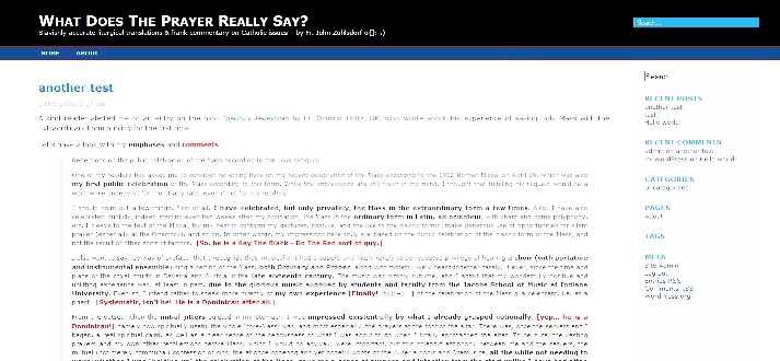








Change Father Z?
Yes we Can!
/risiloquium/ This seems to come up, repeatedly, every few months. /risiloquium/
I like it… The design is a lot cleaner, and seems to be less heavy-weight.
–Jason
Change is good in a spirit of continuum.
Will we still be able to register the same way for posting comments?
Yours is the simplest way of doing so. Some other blogs I go on make things too complicated.
Very nice. It can certainly be seen in a hermeneutic of continuity…
Getting there… keep going
I vote for the “search” feature. Many times I recall a post from years ago and don’t have the energy to go through each post until I find it!
I think it looks just fine, Father. Maybe more red to match the tagline, “Say the Black, do the Red?” I do like how clean-cut it looks.
It needs more red if we are to do the red.
I’m fine as long as it’s easy to read and you maintain a mobile web version. A search function is a nice addition.
I really appreciate the mobile version as I use a Blackberry. Some sites including one good Catholic blog that I sometimes read are nearly impossible to use on my BB because all the graphics.
I like it the way it is.
If it ain’t broke, don’t fix it.
(except adding the search)
As long as the design is not white text on black (MY EYES!), I’ll be happy with whatever you decide Father.
Father Z.,
It looks good. I agree with the “search function” request. I don’t know how many times I have needed to go back to the Msgr. Scicluna interview (at least 4) to retrieve a quote from there to counter comments on some other blogs. I don’t know what blogware you run this on, but I have found the Private Message available at some blogs very useful. It allows one to send an email to a fellow poster without divulging either party’s private email. Just one example of how useful, the poster Tom in NY inquired, on a thread from yesterday, how I had managed to type in some Greek text. I had to choose between posting my email address for him to contact me, or (as I chose to do) posted the answer as an, essentially, Off-Topic comment, which I generally don’t like to do if I have an alternative. I don’t think the short answer (i.e., I did it the same way I get the umlauted ‘o’ in my name as part of my signature) would have been interpreted as a charitable response to his question.
Respectfully,
Keith Töpfer
Didn’t get much detail on the sample, probably my screen size/resolution settings.
Looks nice enough. I definitely second the call for simple, high-contrast text/background that’s easy on the eyestrain, especially mobile versions.
I’m shocked at how similar the quotation from Lampedusa is in its sense, to Newman’s dictum in The Essay on Development.
harrumph. change???
Siding with my fellow Virginian Tina and voting no. We find great comfort in our traditions imported and otherwise – the odd kyrie, semi-nude Roman godesses, ex-Lutheran baritones, etc.
Time to water the horsies…
m
Father, white text on a black background is not very friendly to the eyes. Please don’t go that route.
All: Please understand this. I am not asking for a vote about whether changes are going to happen or not. There are going to be changes.
I have to do the site design myself.
In the past, I have asked for help from people who know what they are doing, but they wind up being undependable.
A good site designer is very expensive.
Therefore, this will take a while, but it is going to happen.
the little I know about web design taught me:
– use more white,
– reduce borders,
– and lessen conflicting colors
these concepts made it easiest to read. Reduction of visual clutter seems to appeal most to readers. This is not unlike the science behind design of old-fashioned paper publications. “Clean” wins.
Unless there’s something really catchy otherwise. LOL.
Happy hunting Father.
Great to have our Holy Father there to watch over us!
I agree with keeping it black text on a white background, and please, please, please don’t lose your list of other blogs you keep track of, I often times like to look at those.
The version posted at 7:01 is much easier on the eyes than the one posted at 5:50. Can you give us a bigger version of the one in the original post? Even on my 19″ monitor it is too squished to get a good feel for the layout.
As I said before, as long as it is easy on the eyes (and I should add, easy to navigate) I don’t care too much.
I know nothing about site design…I wish I could help. I’ll pray you get the assistance you need.
Thank you so much for your blog!
Padre
I request that you retain the Whiskey Tango etc. for the sake of us that still pick this up on shortwave.
That is all (damn army).
m
I second the motion with Geoffrey, a search bar would be immensely helpful. I don’t know how many times I’ve wanted to go back and look up a post and had to sift around for quite while before I finally dug it up.
Before undertaking any voyage, two questions must be answered, and answered with some precision: Why are we leaving and where are we going? Without an answer to the latter, it’s impossible to say whether we’re on course—or, for that matter, if we’ve arrived. (Evaluating the three templates posted above is thus impossible: without knowing the destination, how can one situate them relative to the goal?). And without an answer to the former, it’s hard to see why we’re at sea and rowing in the first place. Change is fine—and is easier to execute—when it has a clear purpose. Respectfully, my $0.02.
Also, I agree with some of the others. Black IS very hard on the eyes. The 7:01 version is much easier to read, but the picture of the Pope was awfully nice…
But Father, but Father…! You would know best what it takes to publish and maintain this great work. From a reader perspective changing what is in no way broken nor unworthy seems like a less than best use of your limited time.
That said, you indicated that regardless of the merits of changing you **will** be changing … so the post @ 7:01 is horrible.
Dear Father,
This comment comes form a graphic designer of 28 years!
The only way to answer your question is with GRAPHIC SAMPLES:
See the attached. Please note no matter how much a non-designer looks at something they will rarely see the white space, the font, the color, the columns, the difference in tone and value, etc. etc, etc.
The sample you have now is not good!
Your only hope is to match one of these sites exactly: http://ideas.veer.com/skinny
http://www.youthedesigner.com/
http://ilovetypography.com/
http://blog.videohive.net/
http://www.videocopilot.net/blog/
These are all mostly OK:
http://www.1stwebdesigner.com/development/worth-reading-social-media-marketing-blogs/
Example of BAD blogs:
http://www.designobserver.com/
Yes it is very hard to program and format, but it’s worth it’s weight in gold. P.S. You need a gorgeous Header! I may be able to help. Contact me directly. Duc in Altum
Dear Father,
This comment comes form a graphic designer of 28 years!
The only way to answer your question is with GRAPHIC SAMPLES:
See the attached. Please note no matter how much a non-designer looks at something they will rarely see the white space, the font, the color, the columns, the difference in tone and value, etc. etc, etc.
The sample you have now is not good!
Your only hope [?] is to match one of these sites exactly:
(email me direct for links)
These are all mostly OK:
(email me direct for links)
Example of BAD blogs:
(email me direct for links)
Yes it is very hard to program and format, but it’s worth it’s weight in gold. P.S. You need a gorgeous Header! I may be able to help. Contact me directly. Duc in Altum [Indeed, Duc in altum!]
thouart: Contact you? I have been down this road before with designers/programmers who say they will help.
The offer is withdrawn! I was simply going to send you links to blogs that LOOK GOOD. Not like yours. Your religious content is fabulous, but I would have never guessed it was written by someone so arrogant.
The “7:01” version looks pretty nice, Father. Perhaps you can include the photo of His Holinees that you have in your “5:50” sample?
Mike
Fr Z,
This suggestion may be more than you would want to deal with, but I’ll throw it out there anyway…how about a header design contest? I’m sure you have many talented readers whose design skills might be helpful to you, and that way you would not have to depend on someone who says they will help and then never follows through. Just a thought.
Ditto on maintaining the mobile version… Very user friendly already.
I’m not sure exactly “what thou art”, but I have a good idea of “what thou ain’t”…
Father, @10:16 is kinda nice. More white, no lines, and areas are delineated with the soft gray, not so harsh as other examples. I tend to like that direction…
A header contest might be fun…wonder how you would manage those kinds of submissions. I like that idea. Not that I’m suggesting that you would wait on us, you could still put something up until something comes along.
Tina: I am not sure about a header contest. I would hate to receive submissions people spent a lot of effort on then not choose any of them.
How would you know you won’t chose any of the designs?
Perhaps it’s your predisposition to arrogance? Perhaps a little too opinionated? (No! not a blogger like you) Seriously, Father, time for some introspection here.
I believe I know clearly why your other offers turned you down. You are a classic PITA customer (Pain In The A…)
They are usually charged double for their ignorance,
and never receive the best work, because they change it until it looks like their original concept of garbage.
You can title your site: designed by a consensus of blind folks led by someone too stupid to take advice from a professional.
Face it folks Fr. Z is human. Not a god.
(You can tell by the garbage layouts that keep appearing) [! “Garbage”! LOL!]
P.S. No one is too old to learn!
[This from someone who wants me to contact him? Nice. I hope he is not in sales for his company.]
“Perhaps it’s your predisposition to arrogance? Perhaps a little too opinionated?”
Projection.
I think from the exchanges above you can see why it is difficult to find help for projects. I am so grateful to Vincenzo, therefore, for his skills and good cheer.