
I am experimenting with themes to try to solve some problems.
About this blog…
“This blog is like a fusion of the Baroque ‘salon’ with its well-tuned harpsichord around which polite society gathered for entertainment and edification and, on the other hand, a Wild West “saloon” with its out-of-tune piano and swinging doors, where everyone has a gun and something to say. Nevertheless, we try to point our discussions back to what it is to be Catholic in this increasingly difficult age, to love God, and how to get to heaven.” – Fr. Z
Coat of Arms by D Burkart
Recent Comments
- on ASK FATHER: Why did dioceses stop using the word, “the” before words like “priesthood”, “Eucharist, or “Church?: “@Ave Maria: Re: “Pope Leo carries Eucharist among 1.2 million people. Not ‘The’ Eucharist…” If that’s the headline of the…”
- on ASK FATHER: Why did dioceses stop using the word, “the” before words like “priesthood”, “Eucharist, or “Church?: “I’m glad somebody brought up this topic. I also find this irritating. In my own diocese, I hear the same…”
- on ROME 26/6 – Day 74-75: Last Day: “White to move and mate in 4. Another complex one with lots of variations. I think I managed to get…”
- on ASK FATHER: Why did dioceses stop using the word, “the” before words like “priesthood”, “Eucharist, or “Church?: “To TheCavalierHatherly, Thank you! (- for both comments). Ye happy Latinists (and Greek scholars)! How many more there were in,…”
- on ROME 26/6 – Day 74-75: Last Day: “Europeans are so anti-AC. And they use Celsius too. ? Have a safe and healthy return home! You are in…”
- on ROME 26/6 – Day 74-75: Last Day: “White mates in four: 1. Nxh5+ g6xN (moving the K leads to a faster mate) 2. Rg3+ Kh6 3. Rf6+…”
CLICK and say your daily offerings!
A Daily Prayer for Priests
Fr. Z’s Podcasts RSS Feed
Federated Computer… your safe and private alternative to big biz corporations that hate us while taking our money and mining our data. Have an online presence large or small? Catholic DIOCESE? Cottage industry? See what Federated has to offer. Save money and gain peace of mind.
ABORTION PILL RESCUE NETWORK
Everyone, work to get this into your parish bulletins and diocesan papers.
Donate using VENMO
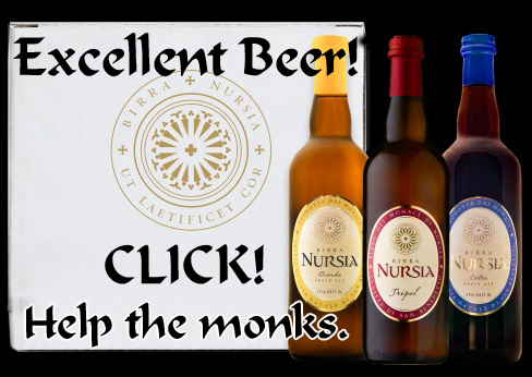
GREAT BEER from Traditional Benedictine Monks in Italy
Good coffee and tea. Help monks.
I use this when I travel both in these USA and abroad. Very useful. Fast enough for Zoom. I connect my DMR (ham radio) through it. If you use my link, they give me more data. A GREAT back up.
Help support Fr. Z’s Gospel of Life work at no cost to you. Do you need a Real Estate Agent? Calling these people is the FIRST thing you should do!
They find you a pro-life agent in your area who commits to giving a portion of the fee to a pro-life group!
This blog has to earn its keep!
PLEASE subscribe via PayPal if it is useful. Zelle and Wise are better, but PayPal is convenient.
A monthly subscription donation means I have steady income I can plan on. I put you my list of benefactors for whom I pray and for whom I often say Holy Mass.
In view of the rapidly changing challenges I now face, I would like to add more $10/month subscribers. Will you please help?
For a one time donation...
To donate monthly I prefer Zelle because it doesn't extract fees. Use
frz AT wdtprs DOT com


EXCELLENT picture. Very timely.
Personally I think this newer theme is a significant improvement! Not that it was bad before, but now it is easier on the eyes.
Perhaps if you added a lightening bolt it would cheer things up.
I like the picture! The new theme is alright. However, I don’t like having to click through to the post’s page to read the whole entry.
This theme loads on my computer better. The one that you had last week, Fr Z, kept throwing my computer offline. I would come onto the site, a whole lot of things would load, and then the computer would just bog down and disconnect. I wasn’t even able to read the blog, even with several tries. I finally gave up and went elsewhere.
PS. I have, in the past, had to go into my browser and disable pictures from loading too. When you have a lot of pictures of birds and things sometimes they don’t want to load without booting me out. I probably should check some old threads, but do you put them up as JPGs or BMPs or do you use some other format?
Wow, what a difference a few hours make!
When I first came online this morning and went on the blog, it still had the ‘old’ heading on top of the home page.
Now I find this new one-I like it, Father Z!
I’ve had some problems lately when I come on; for some reason, it took forever to download. Drove me nuts, especially after I submitted a comment and pressed ‘post’.
Great photo on top….rather spooky-looking!
I prefer the new Graphic Spanner as well.
The new image is very good.
I like the white theme. But I’d like to see an image of a biretta at the top so I know where I am. :) Maybe an animated graphic of a spinning biretta with Christmas lights on it.
LOVE the new header picture.
Fr. Z:
I would like to recommend that you take a look at WooThemes (woothemes.com) if you haven’t already. I’ve begun to use them with a few sites and am very impressed with their ease of use, and their taking many of the frustrations out of WordPress. They’re pretty affordable, come loaded with features, are fully supported, and receive updates often. You might also be interested to check out their eCommerce platform “WooCommerce”. I just felt compelled to share this for your interest.
Best regards,
Adam Bartlett
I have a couple themes from WooThemes.
This is just a minor thing for me, but if there were a border around each individual posts it would make me happy.
Please… don’t get into the weeds with tiny cosmetic adjustments.
I am ready to pull the plug as it is.
I like it
THE LIGHT OF THE WORLD IN THE MIDST OF DARKNESS AND STORMS
I like it – It’s realy nice and clear, easy to read! Great photo too! Was a bit of suprise though!!
Father, this needs a poll. I always like a nice poll. I like this header if you don’t do a poll.
I vote for the thunderstorm
I love it!! Easier to load and much easier for me to read. Thanks.
I really like this one, but got such a shock when I opened the site!
Whatever you do, don’t pull the plug.
I like this particular blog flag. (I also liked the ‘thunderstorm’ one you featured earlier today.)
I might check back more often, Father, if you’re going to change them hourly. ;-)
Excellent! And as an added bonus, this template no longer crashes Safari on the iPod Touch, which means I can switch to desktop view (versus having to read via the web app) which means the font size is bigger in the combox. My 55-year old eyes are rejoicing tonight at the ease with which I can read comments! Being a care giver for my mom, I rarely get to the lap top anymore and read the blog in the wee hours in bed on the Touch. Please know your blog and podcasts have gotten me through many a long, sleepless night and kept my spirits up and soul fed. Be assured of my continued prayers for all your intentions, and those of others who comment here, even though I can rarely chime in.
Catherine B.
Two thumbs up. It loads faster and is easier on the eyes. What’s not to like? Thank you.
I like the new banner across the top of the blog. The picture is awesome. I don’t like the white theme, though – for some reason this version is really hard on my eyes.
I like the ‘newest new’ picture at the top of the page, Father Z! The image of St. Peter’s Basilica all lighted up in the midst of the darkness of a Roman dusk is VERY COOL!
You’re thinking of ‘pulling the plug’ on the blog? Oh, please, don’t do that! What would we do without our daily ‘Father Z fix’?
You’re part of my daily Internet routine!
Father, Like your new photo, you are a light in the darkness for many of us. Please don’t leave. We need you – and each other.
Father, I agree with Angie Mcs. It is a very powerful image. The Church is the bright Light of hope in the gathering darkness.
Fr. Z: your comment about “ready to pull the plug as it is” reminds me of how long it took to build the temple versus how long it would take to destroy it. I amuse myself.
But my vote is: I never liked the “old” look at all. I went for substance over style, however, as all your readers do. But it shouldn’t be a choice! It’s BOTH/AND!!
Like St. Thérèse, I CHOOSE ALL!!
Thanks. I feel better now. Nice theme.
Wow. It’s really white! I personally like the old theme better, but hey, I still <3 this blog! I'll get used to it in no time!
PS- My sister is glad that Basil is still there! :)