
Welcome registrant:
CuriousCatholic
Please remember me when CHRISTMAS shopping online and use my affiliate links. US HERE – WHY? This helps to pay for health insurance, utilities, groceries, etc.. At no extra cost, you provide help for which I am grateful.
Today, Dec. 10, marks the 100th anniversary of the apparitions of the Virgin Mary to Sister Lucia of Fatima in Pontevedra province in Spain, where the devotion of the Five First Saturdays of the month was revealed. https://t.co/8DNoQn5KlC
— Catholic News Agency (@cnalive) December 10, 2025
Here is a puzzle from a famous game. Black to move. Can you spot the move that, in most lines that follow, can either force mate or just win for black?
This is not so easy.
NB: I’ll hold comments with solutions ’till the next day so there won’t be “spoilers” for others.

And, speaking of sneaky …
And confirms @dianemontagna’s revelation that the survey of global bishops found broad satisfaction with SP. So TC was built on a lie. https://t.co/fP1ZaqeyTL
— Damian Thompson (@holysmoke) December 10, 2025
And there’s this.
Maduro “Regime kidnaps Cardinal Baltazar Porras in Venezuela. They prevented him from boarding a plane in Maiquetía [Caracas Airport] and warned him that he will not be able to leave the country again.” https://t.co/5bGyQTy0lR
— Rorate Caeli (@RorateCaeli) December 10, 2025
OH NO! I’ll never use Calibri for my drafts again!
From the NYP:
Marco Rubio instructs diplomats to use Times New Roman font, eliminating Biden-era DEI initiative
WASHINGTON — He’s font and center in the State Department.
Secretary of State Marco Rubio directed all diplomats to revert to using the Times New Roman typeface in official communications and criticized his predecessor for shifting to Calibri, a font deemed too woke for the Trump administration.
I wonder what fount I should use for drafting… I prefer sans serif for drafts. Any thought? I am often prompted to use Aptos.


I like times new Roman.
Father – looks like it’s Comic Sans or Papyrus from here on out…..
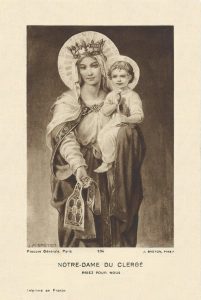
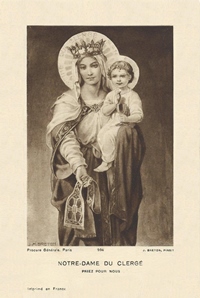
Our Lady of Fatima message needs to be done.
P.s. that picture is not the real Lucia. Sad fake. Whoever that Sister is, it’s not Sister Lucia. There are lots of comparisons on line by experts.
my employer has set the default to aptos – though we can change it prn – i’ve come to like it
“I wonder what fount I should use for drafting… I prefer sans serif for drafts. Any thought? I am often prompted to use Aptos.”
Arial. https://en.wikipedia.org/wiki/Arial
Verdana. https://en.wikipedia.org/wiki/Verdana
“
Once upon a time I edited an academic journal and learned that serif fonts are generally easier for most people to read for sustained times because the serifs help to lead the eye from word to word and more quickly decode letters and words. I am partial to Palatino, which is similar to Times New Roman but a little spiffier, IMHO.
How can a font be woke? Bizarre.
Verdana is a good one, but does weird things to your eyes in the first few minutes of using it.
I too like Verdana, specifically for writing and reading on a screen, but Times New Roman for anything printed.
Ben – some middle manager was probably bored at work and looked up Calibri on Wikipedia, saw it was a “humanist” font, didn’t know what that meant, and went on a crusade looking for brownie points.
I prefer Helvetica and Minion myself.
I prefer Open Sans to Calibri myself. Excellent coverage of many languages. I hate when there’s no numero glyph, ? (for typing foreign address) in a font set among other pet peeves. Verdana was designed by Matthew Carter, who is an interesting man–MacArthur genius award winner, learned his craft on actual hot metal type. He’s an acquaintance of mine.
Ages – good shout. Whenever I hear Helvetica I just think about Switzerland in Roman times.
@Not (above): I was open to the fake Sister Lucy thesis for a good while, but this put that theory to bed: https://www.youtube.com/watch?v=LZ7KAIK_CGs
Typefaces bear a lot of weight, intimating all sorts of associations–even for people who are barely aware that they exist. This line in the sand will politicise things even further, and make it even more challenging for those who want to keep their heads down.
@gsk: You can count me among those who are barely aware of the associations which are intimated by typefaces. I would be very grateful if you should enlighten me by providing more examples. Meanwhile, now that I am aware of the associations intimated by Times New Roman, I will be sure to continue to use it.
The story is that the switch to Calibri was based on the idea that it (and perhaps other sans serif fonts) is easier to read for those who have eyesight issues. That move was recommended to the Biden State Dept. by its own “DEI office.”
I don’t know if people call it woke simply because it came from a DEI office or because it has to do with a disability, which some might immediately get irritated about.
The Trump administration’s rationale is that Times New Roman is more professional looking.
The bottom line is that we should indeed resist DEI crap (because its motives usually come from twisted values), but it this case I wouldn’t get worked up about it either way.