Obviously, I am playing with the blog’s theme again. I am trying to solve the mystery of why, when I change to the new theme I am toying with, the stats won’t count via sitemeter. I might have solved it. Not sure.
Also, I am fiddling around with widgets. I have never been able to use them before, on the old theme.
Also, I am trying to provide some continuity between the old and an eventual new theme.


















Dear Father, the left-margin right-margin thing makes it awfully difficult to concentrate on the bit in the middle. You could try a left (or right) margin and a block at the bottom, or go back to changing a single margin and a main body of text, but this is a bit painful. Sorry.
Father – perhaps a search function added to the site would be nice? I believe this is a one-click add in WordPress and it would help when trying to find posts more than a day or so old. Just a thought.
My $0.02: I like the clear demarcation between individual posts. I have had a hard time finding new headings and posts when I scroll your blog. If you don’t keep this box format, then something that achieves a similar effect is appreciated. The content is great of course, however! Cheers
I like this one.
Sorry, but another “nay” vote for this theme. The uniformity of the font color makes it hard to read the middle, important section while tuning out the left and right blocks on the sides.
i like the podcast player on the right. Easy to find, more likely to be utilized.
Keep up the great work, Father. We’ll read you no matter what theme you end up with.
Father but Father
Please leave more room for your current thoughts.
Left AND right margins leave too much space for commenters rather than substantive posts
Oh and Thanks for all of your work
Like it- the hermaneutic of continuity is good! Perhaps a search bar would be great?
I agree that the left and right bars are distracting. Perhaps a smaller font could be used for them, and then maybe they could be a bit narrower, especially the one on the right which seem wider than the one on the left.
Father, I second the request for a search function. There have been dozens of times I have wanted to look up an old article of yours and been unable to do so.
Maybe I am just not used to it, but it looks too dark to me; Something I would expect to see on a homepage from the 90’s.
Father,
When you change the theme you likely have to add back the html code for the sitemeter. That is what I had to do when I changed themes, at least…
I don’t know much about internet terminology..but there is this thing that plays music that is blocking my view of the first post… is it my browser or the new theme? AMDGPU
Fr. Z,
Near the bottom of the left hand column, I’m getting an error from sitemeter.php. Also, an error from twitter on the bottom of the right column.
I don’t know how easy it is to edit these themes, but it may help if you can give the side bars a more subdued color. It should help the middle pop a bit more.
Aaacckkkk… Father, in I.E. 6 the podcast player is on top of the first post. Even if I open the window full screen, your widgets are somewhat hidden behind the other posts.
But Father but Father! the old layout was so much easier to read. Why taunt us with these new layouts.
I think that if you were to bring over the fonts and sizes from the old theme into this new one people’s blood pressure would drop back to normal.
This layout is making my claustrophobia act up…
I like the new look. Everything looks a bit tidier.
Too much black! I would stick with the primary color: blue white and yellow. Blue is the best for background.
From my workplace computer here, where I have only Internet Explorer as a browser, the posts and comments appear OVER the podcast bar which can only be seen at intervals, peeking through.
This design loads very quickly for me on Safari 3.2.1. The usual template can be a bit slow at times.
Hey Father, I reall like the idea of having the podcast player widget. It makes for easy access and maybe more people might get “hooked” on your podcasts.
Keep up the good work
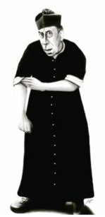
My first reaction was ‘Oh no not more changes’! But I have to admit that I actually do like this layout and find it clear to read. I also like the facility to find the podcazts and the categories. Pleased to see that your biretta has had its pom pom restored! (Apologies if this is not the correct clerical term!)
This is my favorite layout you have tried. Things that used to be in the left hand bar are all at the bottom for me though. I dont know if this is on purpose or not, but either way there shouldn’t be so many things down where they will hardly ever see the light of day.
A black backround is a must, much easier on the eyes when you have dark backrounds on a computer.
Yeah, Father (notice I did not say “yah” like you do, Father), this works.
I like it better than the last try but I think the two side margins should be wider and the middle section more narrow.
This theme is in the spirit of Vatican II, there is no continuity here!
Simply ineffable.