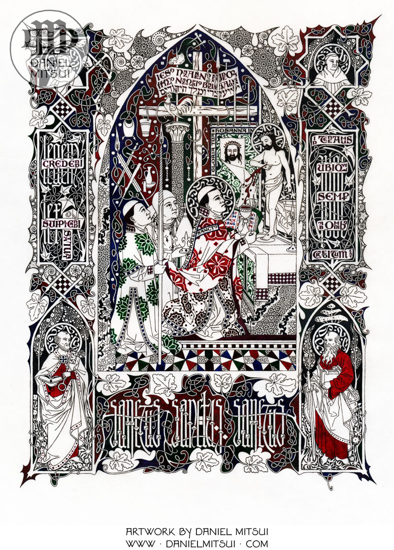
The “Mass of Saint Gregory” is a common subject of art across many centuries, beginning in mid-14th c, though the subject matter dates back to the 8th c with variations. The essentials are these: Pope Gregory I, “the Great” (+604) is saying Mass. He has asked God for a sign to help the lack of faith of a deacon concerning the doctrine of transubstantiation. Christ appears as the “Man of Sorrows” over the altar. You will see very many depictions of this theme when you visit well-stocked museums and many European churches.
Daniel Mitsui, whom I feature here occasionally – really like his stuff – has his own rendering of the Mass of St. Gregory.
Please pardon me, but I left the print in its protective plastic. You can see more HERE.
This is 8″x 10 2/3.

In the bottom corners are Sts. Peter and Paul. In the upper corners are Proper of Aquitaine and Vincent of Lerins.
Notice that on the left, he inscribes Legem credendi lex statuat supplicandi elsewise Lex Orandi Lex Credendi. You see on the right: Id teneamus quod ubique, quod semper, quod ab omnibus creditum est.
As usual, the details are marvelous.

He connects visually the Lord’s Passion and Resurrection with the Eucharist.
It is a great Counter-Reformation image, too. It stresses the doctrine and also papal primacy.

This would be a great gift for a priest or a convert.
Larger right click and open in a new tab.
I haven’t given up hope that Daniel will, one day, do QSO cards!


I think this is his best work yet.
Dan Mitsui’s work is excellent. I’ve given a few prints as gifts and have one at my office. Highest recommendation!
Wow. Am I the only one seeing the world’s best playing card back here? DM should consider monetizing beyond glicee prints….
His work is so gorgeous. I wish he was illustrating children’s books. Can’t you just see the story of a saint, written for a child, illustrated with his work? Or a collection of Saints for an older child.
I seriously don’t mean to be contentious, and I think it’s a lovely drawing. Maybe I’m missing something here, but … what is it in this image that “stresses … papal primacy”?
Awesome. I haven’t looked extensively at his works, but of what I’ve seen so far, this one definitely stands out.
Any idea if the occasional stacking of letters has particular meaning or is it simply a stylistic comparison to the Japanese writing system?
I’d also somehow never encountered a portrayal of “The Mass of St. Gregory.” Thank you for explaining. One of the great things about the internet is how easy it’s now made it for me to explore the other portrayals of this miracle. Among the more interesting is a surprisingly difficult feather mosaic made by a relative of Aztec ruler Montezuma as a gift to Pope Paul III.
“He connects visually the Lord’s Passion and Resurrection with the Eucharist.”
Do you mean the Shroud is symbolic of the Resurrection?
OK, I really, really love medieval art, and well-done derivatives of it.
And I really, really love William Morris’ work, and well-done derivatives of it.
But I just struggle mightily with Mitsui’s artwork, because I really, really want to like it. Really I do.
But despite its clear references to both, Mitsui’s work is *none* of the above, nor is it a comprehensive synthesis of these. I’m not saying that to be unkind, it’s just that the organizational principles and mechanical methods that underlie each of those styles and make them comprehensible, and which serve to guide the eye through the composition, are missing in his work, leaving instead a feeling of tension and yes, even chaos. Good religious art should *never* leave one with a feeling of tension and chaos (unless, of course, it is depicting something evil…but I digress). And good art is *never* random. There is purpose–and economy–in everything.
The randomly jagged edges…what are they for? They have no underlying organic cause. The frantic squiggles…why do they not imitate some scrolling or vining habit one finds in nature, to give them form and purpose? Why is minute detail applied to every available nook and cranny instead of being used to draw the eye toward the most important parts of the composition?
So I always feel conflicted when I see his art, because I want him to succeed, but I also want to see his compositions have a feeling of order and restfulness, to have some sort of organic principle of organization that gives purpose and meaning to each part…and they just never do.
Sorry.
Roma247, I was thinking the same thing. My mom would have said it’s too busy. There are things that draw the eyes here and there. Beautiful though, wonderful.
I love it, and like all his work, I know it would be stunning in real life, and framed! It’s a beautiful work, the facial expressions, and I admit I really like the little rooster.